-
Membership
Membership
Anyone with an interest in the history of the built environment is welcome to join the Society of Architectural Historians -
Conferences
Conferences
SAH Annual International Conferences bring members together for scholarly exchange and networking -
Publications
Publications
Through print and digital publications, SAH documents the history of the built environment and disseminates scholarshipLatest Issue:
-
Programs
Programs
SAH promotes meaningful engagement with the history of the built environment through its programsMember Programs
-
Jobs & Opportunities
Jobs & Opportunities
SAH provides resources, fellowships, and grants to help further your career and professional life -
Support
Support
We invite you to support the educational mission of SAH by making a gift, becoming a member, or volunteering -
About
About
SAH promotes the study, interpretation, and conservation of the built environment worldwide for the benefit of all
SAH Study Day: A New MoMA! (Lee Fellowship Report)
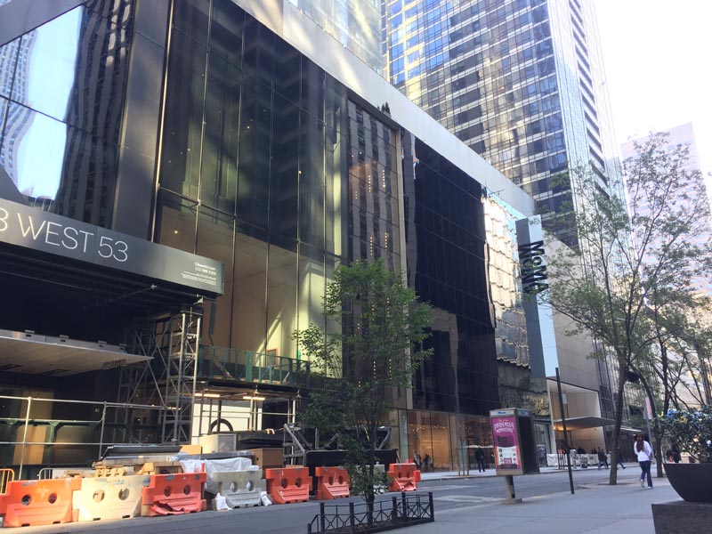
Exterior of the Museum of Modern Art on 53rd Street. Photograph by author.
Confession: I don’t always make it to the museum exhibitions, especially, and embarrassingly so, some architecture exhibitions I want to see despite my best efforts, intentions, or proximity. I still laugh over how I managed to plan a trip to New York after college only to have missed the outdoor presentation of the five full-size model houses constructed for the exhibition Home Delivery: Fabricating the Modern Dwelling at the Museum of Modern Art by a single day. Instead, I peeked through the chain-link fencing to catch a a glimpse of the dwellings and thus the empty lot that has since been developed into an 82-story Jean Nouvel-designed luxury residential tower, providing the additional space for the Modern to expand its permanent collection galleries on the second, fourth, and fifth floors by over 30,000 square feet in what, after a $100 million gift, is now known as the David Geffen Wing. Not all was lost, that visit was still my first visit to MoMA, so there was plenty else to see and get to know. The following year, amidst the chaos that surrounds any move, let alone one to New York, compounded with starting a master’s program, I just flat out ran out of time and energy to make it the 30 blocks and cross-town bus to catch the exhibition Frank Lloyd Wright: From Within Outward at the Guggenheim before it closed. At the time during those two weeks of overlap, a trip to Bed Bath & Beyond was about all I could handle. So, I was glad to be an SAH Study Day Fellow, along with Sarah Horowitz and Elizabeth Keslacy, to participate with colleagues in the SAH Study Day: A New MoMA! on November 1, 2019, to see the museum’s $450 million expansion and renovation by Diller Scofidio + Renfro firsthand, just over a week after its public opening on October 21.
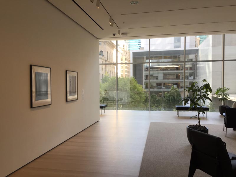
Floor 3 gallery with extensive seating and photographs by Hiroshi Sugimoto of and in dialogue with the Sculpture Garden outside. Photograph by author.
Our day all about the new MoMA began at the old MoMA: we convened together in a 6th floor conference room in the original 1939 building, designed by Phillip L. Goodwin and Edward Durrell Stone. After a welcome from SAH President Sandy Isenstadt, Martino Stierli, The Philip Johnson Chief Curator of Architecture and Design, along with Sean Anderson, Associate Curator of Architecture and Design, led our group through the features of the museum’s physical expansion and renovation, and what that meant for the curatorial approach and collaboration necessary for the newly imagined permanent collection galleries—no longer separated by departmental disciplines—that interweaves individual, thematic, curatorial department-led galleries within a larger, singular arrangement organized, like before, chronologically: 1880s–1940s on Floor 5, 1940s–1970s on Floor 4, and 1970s–Present on Floor 2. It’s admirable, ambitious, and genuinely laudable—and also a little complicated to grasp on the first go-around. Fortunately, a video, which we viewed more than once, helped to untangle the physical interventions made to increase public space (an additional 21,000 square feet for a total of 104,000 square feet), ease vertical circulation through extending the Bauhaus staircase to the ground level and engineering a stunning new staircase dubbed the “Blade” with attendant elevator bank, and add 47,000 square feet in new and renovated galleries for a total of 166,000 square feet of exhibition space.
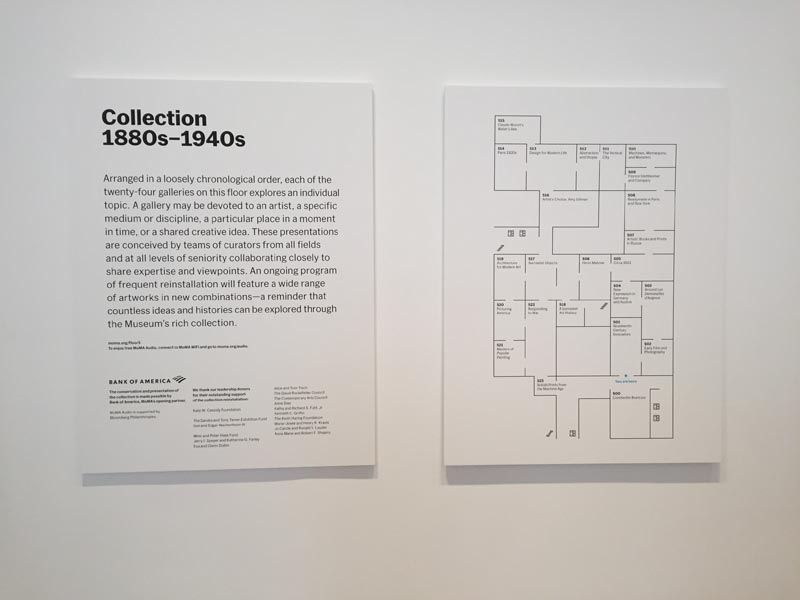
Introductory label and floor plan for Collection 1880s–1940s on Floor 5. Photograph by author.
A floor plan helped to make sense of the other signal maneuver of the new MoMA: the permanent collection galleries will be completely new every 18 months, allowing more works to appear on view among different themes and groupings, the impetus to telling a more complex, dynamic, and diverse story of modernism. In effect, each floor is divided into three sections (each section a suite of individual galleries) with one section reinstalled every six months, so that after 18 months each section will have been rotated once and therefore the whole floor refreshed, anew, so on and so forth, ad infinitum. It’s astounding, really. A flex of the depth and extent of MoMA's holdings, combined with a commitment to acquire new artists, areas, and geographies, but also because, frankly, it’s a lot of work. Such regular, frequent rotations and rethinking of the permanent collection galleries are not just the work of curators or curatorial departments; it’s the work of the entire museum, involving registrars, art handlers, conservators, designers, technicians, educators, and security, among others. The whole undertaking is visionary, exciting, and unprecedented at this scale, but a 30% increase in overall gallery and exhibition space for the permanent collection and temporary shows without, as I understand it, an increase in the requisite staff to make it all happen will test any institution, no matter how determined, efficient, or seasoned. Time will tell. At the very least, and since 1971, museum staff are organized in a labor union, part of MoMA Local 2110.
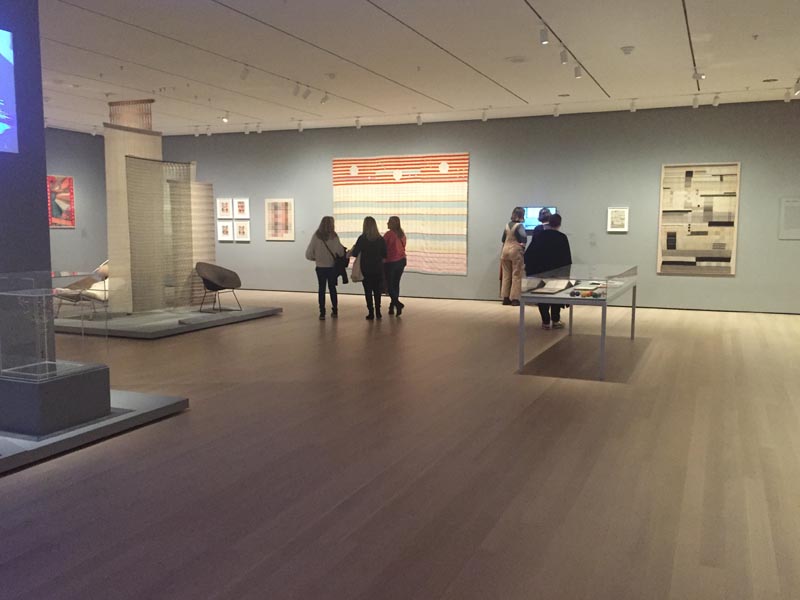
Installation view of exhibition, Taking a Thread for a Walk. Photograph by author.
Oriented, we set out into the museum to tour the architecture and design galleries with the curators. The day was a whirlwind through the museum; lunch, some free time to explore, and a final wrap-up with Anderson also happened. Previously, the architecture and design galleries were contained on Floor 3, separated by a sky bridge and a Bell-47D1 Helicopter (thankfully, the helicopter is still there). The spaces have now been repurposed into galleries for temporary exhibitions (all the opening shows are drawn from the permanent collection), including an excellent exhibition, Taking a Thread for a Walk, about textiles and fiber art. Integrating architecture and design into the expanded, multimedia permanent collection galleries elsewhere frees up this space and exhibition to become a deep, concentrated dive into a design topic, rather than needing to serve as a comprehensive survey of modern design in a single room as it previously did, which is for the better.
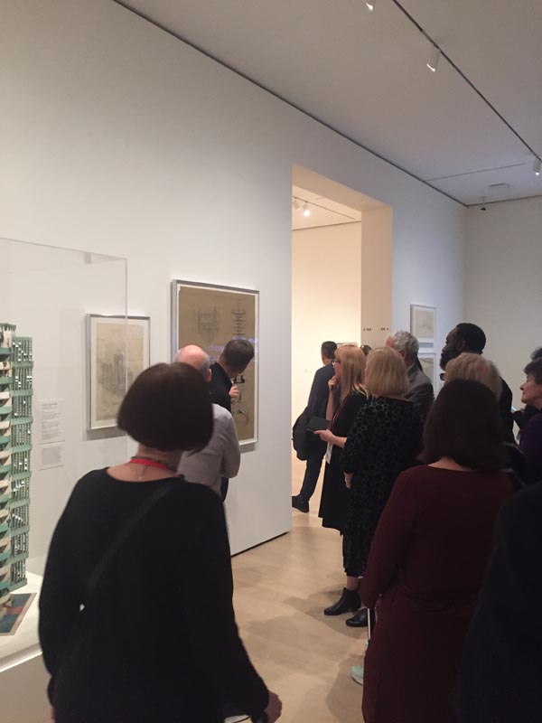
Martino Stierli discusses Frank Lloyd Wright’s St. Mark’s Tower (1929) in the Vertical City Gallery. Photograph by author.
Deftly navigated through the permanent collection galleries by the curators, who did their best to wrangle a group distracted by all the art we were just walking past, we paused to focus on the architecture and design galleries: The Vertical City, Design for Modern Life, Architecture for Modern Art, Architecture Systems, and Building Citizens, along with Sheela Gowda’s Of All the People, and works by Sheila Hicks and Sou Fujimoto up on Floor 6, part of the exhibition, Surround: 11 Installations. I’ll spare a recap, namely because the other fellowship reports provide good observations, but also because, in a practice that all museums should be doing, MoMA puts the permanent collection gallery introductory label, checklist linked to the individual object record, and installation images online. Recognizing that despite the nearly 3 million people who visit the museum every year, even more engage with it on the website, thereby making the collection, its contents and presentation available to those who cannot visit or want to revisit, and continuing MoMA’s pioneering feat in digitizing valuable material from their archive, especially their exhibition history. The day was a thrill, but it was also just a start; I knew I’d be coming back the next morning.
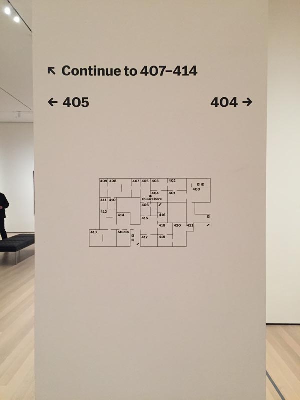
Museum floor plan graphic and wayfinding on Floor 4. Photograph by author.
I spent an additional four hours on Saturday, going through the entire museum. While I knew I’d “need a snack” for energy and a “ball of string” for navigation, and had just been there the day before, left to my own devices, I was still not fully prepared for quite how big MoMA is to take in on a single visit. Looking at a floor plan now, instead of seeing an elegant sequence of three sections in continual rotation, I recalled any experience at an IKEA, where to navigate the large floor plate requires knowing the built-in shortcuts from, say, kitchenware to plants, in order to bypass the meander around lighting and bed linens. But meandering is what the remixed reinstallation is all about, and with great affect. Though each curatorial department maintains “ownership” of an individual gallery, their adjacencies and their careful planning, individually and as a whole, mean that they blur and bleed together, reinforcing shared themes and ideas between and among creative disciplines in the larger cultural project of modernism. For example, I delighted seeing film stills and a poster for Fritz Lang’s Metropolis (1927), after having realized that they shared opposite sides of the same wall in different galleries, Machines, Mannequins and, Monsters for photography and The Vertical City for architecture. That the poster is then paired with a wall showing excerpts from 1920s and 1930s films focused on the changing city makes for a seamless connection across galleries and departments. A subtler connection, which might go unnoticed depending on one’s patience or knowledge, was On Kawara’s Date Painting, MAY 20, 1967, in the Idea Art gallery, which displayed its accompanying box, lined with that day’s New York Post article, “Man with a Plan to Beautify the Ghetto.” This profile of I. M. Pei, who passed away earlier this year in May, about his “Superblocks” plan with landscape architect M. Paul Friedberg in Bedford-Stuyvesant, was a smart curatorial crumb that led into the theme of the adjacent Architecture Systems gallery about all-encompassing architectural schema from component parts.
All this art and museum meandering, with an eye trained on architecture and design, did make me wonder what this means for architectural history and the training of architectural historians. Here, with architecture as an independent and interrelated discipline to art, design and other media, and with most curatorial positions and collections separated between “modern” (i.e. historical and the past) and “contemporary” (i.e. the new and the now), the different academic pathways through primarily art history programs or architecture schools, even professional practice, while disorienting at times, probably serves our field and our scholarship for the better. Meaning that we are able to produce work from a variety of perspectives and methods, able to speak to different people interested in architecture, landscape, the built environment. That said, I look forward to following the process and eventual report of the SAH Data Project, to provide a snapshot of architectural history at this moment and going forward.
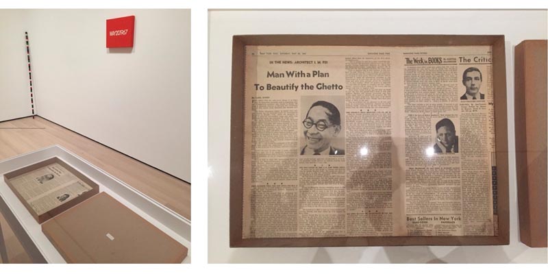
Installation view in Idea Art gallery with detail of newspaper-lined box featuring I. M. Pei article, part of On Kawara’s piece, MAY 20, 1967. Photograph by author.
In the new MoMA it’s easy to get lost, in the good serendipitous sense and also in the “How did I get here and how do I get there?” sense. The new floor layout for the permanent collection on Floors 4 and 5 is expansive, possible because of the purchase and demolition of the Tod Williams and Billie Tsien-designed American Folk Art Museum (2001) and in the aforementioned base of the Nouvel-designed tower. It’s a seamless extension, “smart, surgical, sprawling, and slightly soulless.” Which begs the question: If the 2004 Taniguchi expansion prided itself on being able to “make the architecture disappear,” then what, ultimately, could any expansion and renovation in the same language of restrained minimalism have looked like, except more of the same? Despite dark steel-framed door surrounds and subtle changes in flooring that demarcate the different buildings, the slickness and sameness of it all made me lament the loss of the American Folk Art Museum that much more, with its bronze origami-shielded façade that unfolded within into a complex, split-level sequence of galleries and staircases, a building full of character and personality. While I understand that the floor plates may not have aligned, or something like that, I will always wonder whether if, instead of a real estate transaction of plot value, that the building itself had been acquired, accessioned as an object into the museum’s permanent collection, then adapted as part of the expansion and renovation, rather than an obstacle to be bulldozed. Museums acquire and maintain modern buildings for their inherent aesthetic and cultural significance all the time. In this instance, the past is already buried and built over, but it also makes me think about the important role, even responsibility, curators and museums have as public advocates for preservation and landmarking in their own cities as civic and cultural leaders.
With a bold, wall-size work reading “Hello. Again.” by the artist Haim Steinbach overlooking the new, sunken gift shop, detailed in blond wood and complete with freestanding glass elevator, the similarity between the new MoMA and an Apple store is clear and has been pointed out elsewhere, but I’ll go one step further since, during this visit to New York, I also made a point to visit the new Foster + Partners-renovated flagship store, Apple Fifth Avenue, which originally opened in 2006, designed by Bohlin Cywinski Jackson. The underground retail space has been rebuilt, expanded in floor size and ceiling height and now includes 18 skylights to bring in more natural light, with the original glass staircase and elevator remade in glass and stainless steel, among other improvements. While the 32-foot jewel-box glass cube of an entrance has stood on the same footprint, over the years it has been refined with fewer glass panels and reduced framing supports, the result of advancements in material and construction technology. The relentless march of progress, one of continual refinement, whether MoMA or Apple, seems to occur on a roughly 15-year cycle now. Our culture and our capitalism, like modernism, blur and bleed.
Craig Lee is the Daniel F. and Ada L. Rice Postdoctoral Curatorial Fellow in the Department of Architecture and Design at the Art Institute of Chicago, where, among other projects, he assists with modern architecture and design rotations in the permanent collection display, Past Forward, and conducts research and cataloguing on the Bruce Goff Collection. He is a Ph.D. candidate in the Department of Art History at the University of Delaware.
Leave a commentOrder by
Newest on top Oldest on top