-
Membership
Membership
Anyone with an interest in the history of the built environment is welcome to join the Society of Architectural Historians -
Conferences
Conferences
SAH Annual International Conferences bring members together for scholarly exchange and networking -
Publications
Publications
Through print and digital publications, SAH documents the history of the built environment and disseminates scholarshipLatest Issue:
-
Programs
Programs
SAH promotes meaningful engagement with the history of the built environment through its programsMember Programs
-
Jobs & Opportunities
Jobs & Opportunities
SAH provides resources, fellowships, and grants to help further your career and professional life -
Support
Support
We invite you to support the educational mission of SAH by making a gift, becoming a member, or volunteering -
About
About
SAH promotes the study, interpretation, and conservation of the built environment worldwide for the benefit of all
SAH Study Day: A New MoMA! (Keslacy Fellowship Report)
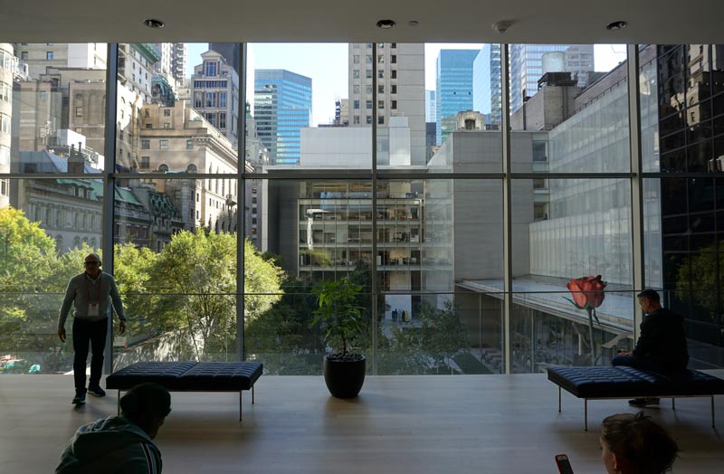
MoMA Sculpture Garden viewed from a new 2nd floor lounge. Photograph by the author.
The times they are a-changing … and the currents of change are sweeping up even those dominant museum institutions who have historically conferred significance on a mostly white, mostly male, and thoroughly Western cadre of artists, designers and architects through restrictive acquisitions policies and canon-enforcing exhibitions. But in a #metoo world in which the Merriam-Webster word of the year is the singular pronoun ‘they’ and the so-called ‘post-racial’ promise of the Obama years has been thoroughly, completely debunked, the exclusivity of the western canon is past-due for a reckoning. Following on the heels of major reorganizations at peer institutions like the Tate and the Pompidou Centre, the venerable Museum of Modern Art has undergone a physical expansion and renovation as well as a complete reimagining of the permanent collections—all with an eye toward increasing access and prying open the canon through the values of diversity and inclusion.
On November 1, 2019, members of the Society of Architectural Historians were privileged to come together for a day-long, in-depth look into the changes afoot at MoMA, which I was honored to join as a Study Day Fellow. Led by Martino Stierli, The Philip Johnson Chief Curator of Architecture and Design, and Associate Curator of Architecture and Design Sean Anderson, the group was treated to a series of presentations, tours and discussions about the physical and intellectual reorientations recently undertaken by the institution. I was curious to understand how architecture and design, so often subordinated to the fine arts of painting and sculpture, would be integrated into a more cohesive presentation. Furthermore, given that architecture as a professional practice has had race and gender problems perhaps even more egregious than the art world, I was keen to see what curatorial changes the values of diversity and inclusion would motivate. Finally, I knew that the museum planned to address issues of access, and I wondered in particular how they would solve their enviable dilemma of owning a permanent collection that far outstrips the capacity of its exhibition spaces, and the resulting widespread lack of access to a warehouse full of objects that sits idle in deep storage while the canonical crowd-pleasers hold audience in the galleries.
Addressing these and other issues, the museum conducted a total restructuring of the curatorial vision and the corresponding gallery organization while the museum was temporary closed for renovation and expansion. One decisive change made in the new vision is to fully integrate architecture, design, photography and drawings into the same exhibition experience as painting and sculpture, which were previously segregated from one another. Objects of all types from the permanent collections are now shown on three floors that hew to a chronological set of three periods. The ideal visitor first visits the 5th floor for early modernism and the avant-garde to the end of the second world war (1880s-1940s), then the 4th floor for post-war, midcentury objects (1940s-1970s), and finally the 2nd floor for those produced from the 1970s to the present, thereby doing away with separate “contemporary” galleries.
To increase access to the permanent collection, the museum has developed an ambitious plan to rotate objects sesquiennially, with one third of the galleries to be reinstalled with different works every six months. So, instead of the less than 5% of the permanent collection that was previously on view at any one time, a diligent museum goer could experience something closer to 20% of it over a year and a half of visits. Addressing the question of access another way, two ground-floor galleries on the western end are freely open to visitors without the purchase of a ticket.
In the department of architecture and design, the ethos of diversity and inclusion is most visibly manifested at the scale of the individual gallery. Rather than installing the galleries according to a single narrative of avant-garde Modernism, or even a single continuous chronology, the galleries feature a multiplicity of interpretive lenses, interests and stories that are expressed through explicitly titled themes. The thematic approach allows curators to take a variety of cross-sections through the permanent collections, highlighting affinities, debates, or continuities that wouldn’t emerge through a flatter, single historical narrative. It also allows curators to mix well-known works with deeper cuts, thereby exposing the visitor to a broader constituency of artists and designers. And while each gallery is “owned” and programmed by a single curatorial department, the curators work collaboratively to install a variety of media in each room to most fully engage the chosen themes. Most significantly for an architectural audience, architecture and design are no longer segregated from the rest of the museum, but are rather fully integrated into and prominently located on each of the permanent collections floors.
For example, on the 5th floor “The Vertical City” gallery Martino Stierli explores the emergence of the skyscraper in the late 19th century and its early 20th-century developments. The centerpiece of the installation is undoubtedly two large models of unbuilt Frank Lloyd Wright skyscraper designs—the San Francisco Call Building (1913) and St. Mark’s Tower (1927–29)—as well as what might stand as the single most canonical Modernist image, Mies’ charcoal rendering of the Friedrichstrasse Skyscraper project (1921). To round out the theme, the curators included architectural photography by Edward Steichen, Berenice Abbot and Alfred Stiegliz, El Lissitzky-designed covers of avant-garde Russian journals, pencil drawings of a less familiar housing design by the German brothers Heinz and Bodo Rasch, and the famous film poster for Fritz Lang’s Metropolis (1926). The biggest innovation, however, is the inclusion of motion picture clips from films like Dziga Vertov’s Man with a Movie Camera (1929) and Walter Ruttmann’s Berlin: Symphony of a Great City (1927). Within those film loops, one can see another canonical moment in the history of Modernist architecture, but this time come alive with motion: Le Corbusier’s disembodied hand not just gesturing at the Plan Voisin, but animatedly sweeping across it.
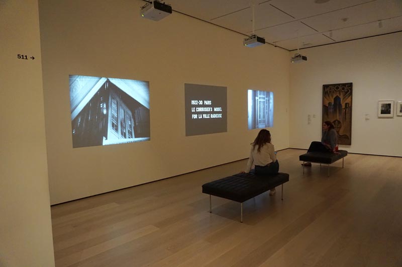
Flip clips projected in the “Vertical City” Gallery. Photograph by the author.
The Department of Architecture and Design, like the rest of the institution, has seriously contended with the new mission of diversity and inclusion. The “Building Citizens” gallery on the 2nd floor responds particularly thoughtfully to that mission, addressing questions of community and belonging through a collection of projects on houses and housing. Set amid a large-scale projection of clips from The Pruitt-Igoe Myth (2011), curator Sean Anderson assembled a variety of projects from the speculative to the built, including drawings from Peter Eisenman’s House VI (1972–1975) and sketches and photographs of Alvaro Siza’s SAAL S. Victor Social Housing project built in Porto, Portugal (1977). The gallery also presents a number of the museum’s splendid collections of architectural models: before-and-after models of Lacaton and Vassal’s Tour Bois-le-Prêtre (2008), Ryue Nishizawa’s Moriyama House (2005), and OMA’s Maison à Bordeaux (1998), among others.
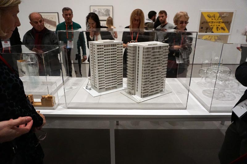
Architectural models on display in the “Building Citizens” gallery. Photograph by the author.
It is in this gallery that one finds important evidence of the museum’s new commitments: a selection of photographs by the architecturally trained, Chicago-based visual artist, Amanda Williams. Taken from her Color(ed) Theory series (2014–16), the photographs depict abandoned houses in Chicago’s Englewood neighborhood slated for demolition that she painted with bright colors associated with advertising geared toward African Americans. Contributing the crucial voice of the artist-activist, her work reveals the economic, social, and political forces at work in the built environment that are beyond the power of any single building to resist. Surprisingly, Williams stands as the first female African-American to have works acquired for the permanent collection in architecture—and it was a decision not without controversy, as some in the acquisitions committee felt the works were more suitably placed in the department of photography. While the new curatorial agenda engenders a variety of benefits—more integration among art forms, and a greater diversity in both creators and themes to understand their work—the mandate of collaboration seems also to have injected some difficulty, in that now curators must address not just their own baggage of disciplinary bias, but their sister departments’ as well.
The museum seems to be extending the ethos of inclusion beyond the categories of human identity to make room for new kinds of objects subject to acquisition. In the “Architecture Systems” gallery on the 4th floor one is confronted by the first and only instance of a large-scale mass-produced fragment of an existing building in the permanent collection: three panels of original curtain wall from the iconic United Nations Secretariat in New York City (1952). As one of the first applications of curtain wall technology to a skyscraper in the United States, the United Nations fragment serves well as the anchor for the gallery’s theme of rules-based systems in architectural design. Installed in the center of the gallery, clips from Jacques Tati’s Playtime (1967) are visible upon entering through the green glass and aluminum mullions of the wall. Viewing Tati’s playfully absurd rendering of the office landscape is made all the more poignant when viewed through the screen of the curtain wall that undoubtedly witnessed some less aesthetic but more frustratingly bureaucratic version of the modern workplace. Monsieur Hulot’s inability to navigate the social and spatial logic of the office stands in stark contrast with the rest of the gallery’s architectural propositions, which celebrate the top-down imposition of complex systems to their sometimes rational, sometimes farcical, conclusions. There it is joined by urban proposals by Constant, Peter Cook, and Kisho Kurakawa, furniture design by Ettore Sottsass, and Mies’ well-known collage of his Chicago Convention Hall project (1954).
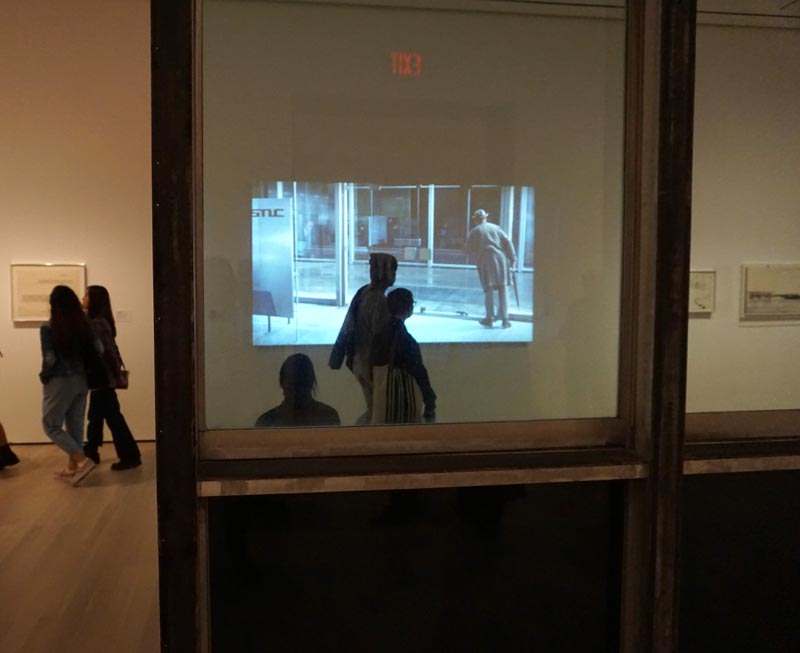
Jacques Tati’s Playtime visible through a fragment of original curtain wall from the United Nations Secretariat building. Photograph by the author.
These architectural works are joined by a series of studies by the Brazilian artist Lygia Clark, whose early formalist, two-dimensional paintings were similarly motivated by a strong internal logic of compositional rules. The wall text explaining the gallery’s theme is too succinct to make explicit connections between the architectural and artistic propositions. Rather, the visitor is left to interpret the inclusion of Clark’s drawings visually or formally, or the motivated guest can mine the museum’s website where short audio clips and longer written texts are made available. For those desiring to dive more deeply, MoMA’s non-western research program, entitled Contemporary and Modern Art Perspectives (C-MAP), provides deeply researched essays on artists and movements from Africa, Asia, Central and Eastern Europe, and Latin America published on their website, post.
The new curatorial directions undertaken by the museum are spatially underwritten by the museum’s physical expansion, most recently designed by Diller, Scofidio and Renfro working in collaboration with Gensler. (See an explanatory video of the overall project here.) The expansion involved the construction of a new building on the site of the former Folk Art Museum, expansion further west into three floors of the Jean Nouvel-designed 53W53 residential tower, and a total reconfiguration of the museum’s existing quarters. The result includes a vastly opened up ground floor with a particularly spectacular sunken, double-height retail space that is visible through the 53rd Street façade.
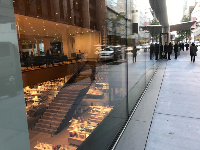
View of the MoMA Store from 53rd Street. Photograph by the author.
Diller, Scofidio and Renfro, known for their own spectacular work on the High Line and the Broad contemporary art museum in Los Angeles among others, has managed an elegant and understated renovation that eschews the complex geometries found in their recent projects, but beautifully utilizes the sectional play of variable ceiling heights and corresponding diagonal views between floors that the firm is fond of creating. The centerpiece of the new addition is an exquisitely detailed, six-story stair called “The Blade” that facilitates vertical circulation on the western end of the building and a dazzling, unobstructed view out into the city. Some of the most spectacular spaces in the newly configured MoMA are those devoted to special exhibitions, temporary installations, and experimental media. There one finds some of the most voluminous spaces designed to accommodate large scale works, new media and performance, and they often feature large areas of glazing admitting natural light that would harm older, more delicate objects.
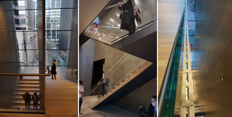
Views of the Diller, Scofidio and Renfro-designed “Blade” stair. Photograph by the author.
The physical and curatorial changes at the Museum of Modern Art are new, and it seems clear that the curators are still exploring what’s possible at the intersection of the institution’s long history, the facts of its permanent collections, and its ambitions to practice the values of social justice and inclusivity. The institution’s willingness to engage in self-critique and course-correction is laudable, and I’m excited to see what new voices and new interpretive lenses the curators will bring in to public view.
Elizabeth Keslacy is Assistant Professor of Architecture at Miami University of Ohio. She is an architectural historian whose work centers on the museology of architecture and design, the intellectual history of concepts like ‘decoration’ and ‘design’, and the reception of postmodern architecture. She is currently at work on a monograph tracing the history of the Cooper Hewitt, Smithsonian Design Museum. Her work has been published in the Journal of Architectural Education, Footprint, Thresholds, and Lotus International. Keslacy earned a M.Arch from the Southern California Institute of Architecture and a Ph.D. in architectural history and theory from the University of Michigan.
Leave a commentOrder by
Newest on top Oldest on top