-
Membership
Membership
Anyone with an interest in the history of the built environment is welcome to join the Society of Architectural Historians -
Conferences
Conferences
SAH Annual International Conferences bring members together for scholarly exchange and networking -
Publications
Publications
Through print and digital publications, SAH documents the history of the built environment and disseminates scholarshipLatest Issue:
-
Programs
Programs
SAH promotes meaningful engagement with the history of the built environment through its programsMember Programs
-
Jobs & Opportunities
Jobs & Opportunities
SAH provides resources, fellowships, and grants to help further your career and professional life -
Support
Support
We invite you to support the educational mission of SAH by making a gift, becoming a member, or volunteering -
About
About
SAH promotes the study, interpretation, and conservation of the built environment worldwide for the benefit of all
Architecture in the Rio de la Plata Basin: Between Tradition and Cosmopolitanism
A Brief Introduction…
The Rio de la Plata (the River Plate) basin, one of the widest in the world, is a region rich in architectural culture. The urban landscapes and architecture of its major cities have largely been shaped by the immense waves of immigration that reached its shores in the early 20th century, resulting in a unique architectural eclecticism. The explosion of Buenos Aires’s export economy in the late 19th century and its rise as a major port city established its prominent position in global modernity, accounting for the overwhelming emphasis on late 19th and 20th century monuments in the tour. The early decades of the 20th century witnessed a constant negotiation between a conservatism (steeped in European academicism and later, a neocolonial ‘national style’) and a radical modernism in architectural trends and culture more broadly. Culturally speaking, in both Buenos Aires and Montevideo there is a strong identification with Europe (due to the influx of European immigrants, mostly from Italy and Spain). We were fortunate to visit Montevideo, Buenos Aires, La Plata, and Córdoba on the heels of the recent exhibition Latin America in Construction: Architecture, 1955–1980 at the Museum of Modern Art, which frequently came up in discussions and several notable figures affiliated with the exhibition generously shared their knowledge of many of the buildings that were featured in the show.
My interest in the region runs deep; I have traveled to Buenos Aires on many occasions and my doctoral research focuses broadly on modern art and architecture in the Southern Cone. Although my dissertation examines on a group of ‘poet-architects’ in Valparaíso, Chile, their intellectual and artistic networks within the Rio de la Plata region were rich and manifold (from the influence Joaquín Torres-García’s Americanist pedagogy to their correspondence with Argentine architects and designers such as Tomás Maldonado and Amancio Williams). The SAH tour was an ideal opportunity to focus specifically on architectural culture and visit new sites and cities.
Day 1: Sept. 2, Montevideo, Uruguay
After a red eye flight to Buenos Aires, a long bus transfer between airports, and a very short ½ hour flight over the Rio de la Plata, I finally arrived to Montevideo’s airport (designed by Rafael Viñoly), the largest city and capital of Uruguay. A couple of fellow tour participants and I arrived at the Montevideo airport where we were warmly greeted by our local guide, architect Alexandra Elices. We took the scenic route along the Rambla, the coastal promenade constructed in the 1920s, which influenced most future urban development toward the river. In Montevideo, the city is in greater dialogue with the river than in Buenos Aires, where the river is not as visible within its sprawling urban fabric.
As an art historian studying synthesis of the arts in the region, I was thrilled to begin the tour at the Torres-García Museum. Joaquín Torres-García (1874–1949) was a major figure associated with the emergence of geometric abstraction in the Americas and development of the discourse on synthesis of the arts (integración plástica) in the Rio de la Plata region. After nearly 43 years abroad, living in Barcelona, New York, and Paris and experimenting with different avant-garde movements, Torres-García returned to his native Montevideo in 1934; the following year he penned his manifesto “School of the South” and formed the Asociación de Arte Constructivo (AAC) which called for a local and regional American avant-garde. He had already begun to theorize his “Universal Constructivism,” which synthesized the universal symbols of ancient cultures and a modern constructivist aesthetic, combining figuration and abstraction, but his desire to form a distinctively American modern art prompted a stronger identification with the visual culture of ancient American civilizations (particularly ancient Andean cultures). Torres-García was also a very public figure in the cultural scene of Montevideo, a prolific writer, and educator (he established the Taller Torres-García in 1943); thus it came as no surprise to discover the ubiquitous imprint of his American constructivist aesthetic in the visual culture of the city.

One of Joaquín Torres-García’s “inverted map” drawings.
.jpg?sfvrsn=ede9529b_2)
A Torres-García-style mural in Montevideo. The image became an iconic symbol of Latin American modernity and more broadly challenges hegemonic perceptions of the global south, while forwarding a strategy of inversion employed by Latin American avant-garde artists.
After our visit to the museum and an appropriately meat-heavy lunch, we strolled through Ciudad Vieja (Old City). Alexandra pointed out the stylistic variety in the streets, ranging from Art Deco, neoclassical, to modern. I was particularly impressed by the generalized prevalence of Art Deco in this part of the city.
Our walking tour eventually led us to the Teatro Solís, a civic theater commissioned in the mid-19th century that reflects Montevideo’s cosmopolitan aspirations and identification with European culture. In 1840, when the population of Montevideo was a mere 40,000 inhabitants, Montevideo’s business and social elites organized a society to construct a public theater. The theater was originally designed by Italian architect Carlos Zucchi and later adapted by Francisco Javier De Garmendia. The central pavilion was completed and opened in 1856, but the side wings were not finished for another three decades, complicated by a financial deficit following Uruguay’s involvement in a war. The theater’s horse-shoe auditorium is celebrated for its acoustics, and is comparable to La Scala in Milan (the overall design references Italian neoclassical theaters).
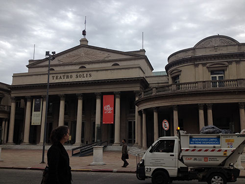
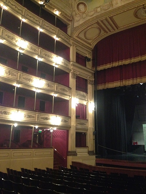
Exterior and interior views of the Teatro Solís.
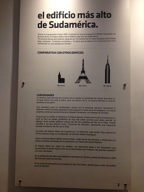
The next and final stop on the day’s itinerary was the Palacio Salvo (1928), which is one of two early skyscrapers in the Rio de la Plata designed by Italian architect Mario Palanti (1885–1978) (along with its “sibling,” the Palacio Barolo in Buenos Aires, which I discuss in my entry on “Day 4: Buenos Aires”). The Palacio Salvo was the latter commission and was, at the time of its inauguration, the tallest skyscraper in South America until 1935 when it was eclipsed by the Kavanagh building in Buenos Aires. Palanti studied at the Academia di Brera and the Polytechnic of Milan and traveled to Argentina in 1910 with his professor to work on the Italian Pavilion for the 1910 Centennial Exposition. After serving as a volunteer in the Italian armed forces during World War I, he returned to Argentina in 1919 (where he remained until 1929) hoping to find new clients, particularly among the increasingly prosperous Italian immigrant community in the Rio de la Plata. South America also served as a testing ground for Palanti’s ambitions to build a skyscraper of visionary proportions for Mussolini. The Palacio Salvo was commissioned by the Salvo brothers, who were sons of Italian immigrants and entrepreneurs in the textile industry; the skyscraper visualized their commercial success and represented a “gift” to the city. Designed as a multi-use skyscraper, the Palacio Salvo originally housed a hotel, commercial spaces, a restaurant and bar, offices, and a shopping arcade (Currently, the skyscraper is now a mixture of offices and affordable housing.). The contradictions between modern technology and eclectic forms reflect Palanti’s persistent effort to articulate a new architectural language, a “Latinized” skyscraper for the Pampas. Our incredibly knowledgeable SAH local representative, Natalia Muñoa pointed out, and as you will read on my entry on the Palacio Barolo, that there are several myths constructed around Palanti’s skyscrapers that are not necessarily substantiated in historical documents.


From the tower of the Palacio Salvo, we were afforded sweeping views of the Plaza Independencia. Designed by Carlos Zucchi in 1937, the plaza marked the border between the Old City and the modernizing northern area of the city. The plaza is surrounded by significant buildings and monuments, including the presidential palace (the Executive Tower), the modern housing block Ciudadela Building (designed by Raúl Sichero), the Ciudadela gate (one of the few remaining sections of the old city walls), and the Palacio Salvo.
Although not officially part of the tour, I was interested to learn that our hotel was located right next to the Punta Carretas shopping mall, which was formerly Montevideo’s prison (where the Tupamaros orchestrated their famous prison break in 1971). Scholars such as Susana Draper and Hugo Achugar have written about this shopping mall, which is the earliest example of the phenomenon of converting former prisons and detention centers into places of consumption and spectacle in post-dictatorial societies in Latin America.
Day 2: September 3, Montevideo and Atlántida: Julio Vilamajó and Eladio Dieste
On day two we began our tour at the house of Julio Vilamajó (1894–1948), one of key figures of architectural modernism in Uruguay. Vilamajó studied architecture in Montevideo where he received a rigorous academic training based on a traditional Beaux Arts-inspired program. After travels to Europe and North Africa, Vilamajó aspired to modernize Montevideo. At the Casa Vilamajó, the architect was forced to work within the confines of a narrow corner lot and comply with regulatory setbacks laws on both streets. His solution was to create a “domestic tower,” a five story building organized around function and public/private spaces. The top floor, for example, served as his studio space and resembled the captain’s lookout of a ship. Each floor has a distinctive character and decorative scheme. In several of the rooms, our guide commented on the “Loosian” appearance of the interior décor due to the use of rich materials. Many rooms also include his built-in furniture, pictured below. Although Vilamajó was an avid proponent of the modern, he did not entirely dispense with historical references. The house resembles an Italian Renaissance villa, the outdoor pond references the Alhambra, and the small blue and green ceramic pieces that break up the austere façade were inspired by the House of Shells in Salamanca. Vilamajó’s close friend, sculptor Antonio Pena designed these ceramic pieces and the round relief of Medusa (an apotropaic device), which also reference the sea.
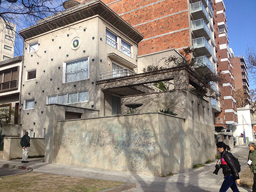

Our guide alluded to symbolism (much of it associated with freemasonry) in the design throughout the house; for example the central golden pillar that runs through the entire house represents geometric proportion and order.


The five floors are organized around a central staircase
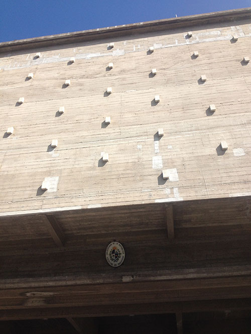
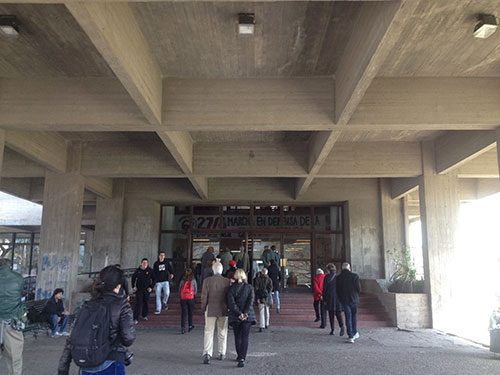
After our visit to the house-studio we continued our Vilamajó-themed morning at the Facultad de Ingenieria (School of Engineering) of the Universidad de la República, considered the architect’s most significant built work. The School is located in the Parque Rodó (where Torres-Garcia’s Monumento Cósmico is also located, but which we unfortunately did not have time to visit) along the Rambla Sur, a site with which Vilmajó was familiar. The land was originally intended to be the location of a football stadium, which Vilamajó was also commissioned to design, but was never realized due to disputes over claims to the site. The president of the Comisión para la Rambla Sur was also president of the Engineering School and fought to preserve the land for this purpose, finally convincing the football club to turn the land over to the School. Since the municipality owned the land, a competition was called and Vilamajó’s proposal was selected. We were fortunate to have a guided tour of the building and its surroundings with Gustavo Scheps, the Dean of the School of Engineering and a contributor to the MoMA catalogue entry on Uruguay. Scheps emphasized how Vilamajó’s design functioned as a pedagogical tool (exposed beams and other structural elements in the building would instruct students in proper construction methods). He also explained that the abstract spatial concept that influenced Vilamajó’s design was St. Mark’s in Venice. The design features blocks of classrooms and laboratories organized around a central corridor; the concrete volumes are supported by pilotis that create an open space for social interactions and pedestrian traffic on the ground level, while also facilitating views of the river from the classrooms and studios. Each block is dedicated to a specific function and is distinguished through exterior design (unique surface textures). The concrete protruding elements on the façade pictured below are similar to the ceramic pieces in his house, and also suggest an attempt at plastic integration.
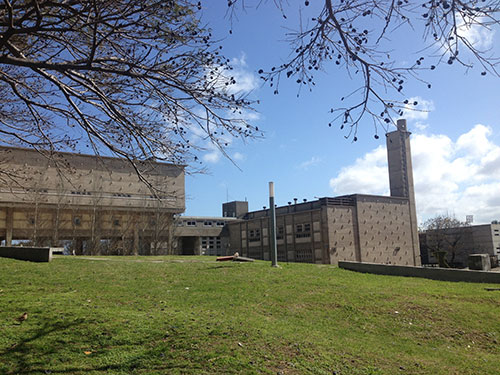

Vilamajó’s reputation in Uruguay led him to be one of eleven architects chosen to design the UN headquarters in New York in 1947. Although he traveled to New York and participated in preliminary planning, his ailing health forced him to return to Uruguay. He died in 1948 before the project was completed.
In the afternoon, we traveled by bus for about one hour to the seaside resort (or balneario) Atlántida to visit Eladio Dieste’s Iglesia de Cristo Obrero y de la Virgen de Lourdes in nearby Estación Atlántida, the community of workers employed by the resort. The church was commissioned and financed by Alberto Giudice, a relative of the prominent Urioste family, wealthy stockbreeders and members of the local branch of Acción Católica, who also helped develop Estación Atlantida and backed the proposal to construct a church. The wealthy patron approached Dieste (who was recommended by a local builder) about designing a simple, inexpensive structure (a galpón or “warehouse”) for the community, assuming that the workers’ limited or lack of aesthetic sensibility did not require an elaborate design. Although Dieste, an engineer by training, initially suggested Guidice hire an architect for such a complex project, he decided to prove his client wrong by accepting the challenge to work with the limited budget (Dieste was also not compensated for the project) while a creating a highly innovative and expressive design using an inexpensive local material, ladrillo (brick). The structure is a simple brick volume and the nave is spanned by Gaussian vaults, which are in turn supported by undulating support walls (Dieste was familiar with the thin-shell concrete structures of Félix Candela and Antonio Gaudí’s experimentation with catenary arches, which he applied to his design in brick). Although a daring, innovative engineering feat, the overall design is expressive of a more humble, non-hierarchal worshipping experience that facilitated a more direct relationship between clergy and worshippers. In several aspects, certain design features (the spare interior decoration and the low level placement of the altar and pulpit closer to the congregation) paralleled Acción Católica’s more humanist approach to Catholicism and anticipated reforms of the Second Vatican Council in 1963.


Dieste’s radical interpretations of sacred space include the subterranean baptistery that is separate from the church proper.
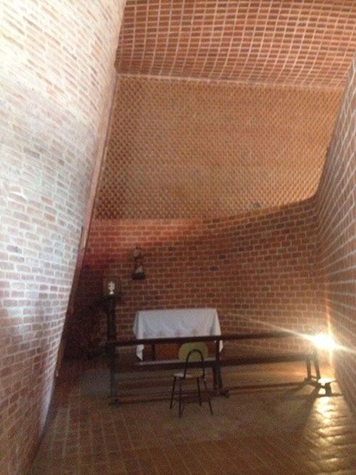
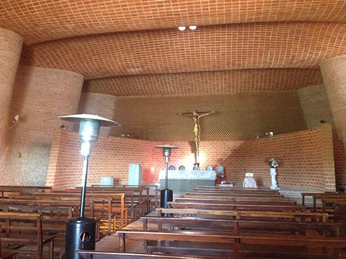

Because the single-shell brick wall could not support large glass windows, Dieste used small rectangle and square pieces of onyx for windows.
Later in the afternoon, Alexandra facilitated visits to important modernist apartment buildings that were not formally part of the tour, the Edificio Panamericano designed by Raúl Sichero (1958–1964) and the Edificio Pilar (1957–1959) designed by Luis García Pardo and Adolfo Sommer Smith. At the Panamericano, we had the opportunity to meet architect Rodolfo López Rey, who invited us to his apartment and gave us an informal tour of the building.
Day 3: September 4, Montevideo-Colonia del Sacramento-Buenos Aires
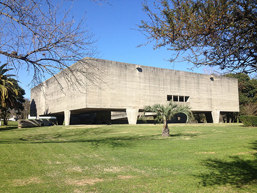
In the morning we visited the Columbarium designed by Nelson Bayardo in 1959–62. I was initially struck by the “Paulista” appearance of the structure, but Natalia explained that, although roughly contemporary, no explicit connection has been identified between the Columbarium with the work of the “São Paulo School.” An entirely reinforced concrete monumental structure, the large unfenestrated volume and concrete promenande architecturale are perhaps closer to the postwar béton brut work of Le Corbusier than Bayardo’s Paulista contemporaries. Natalia also wrote in our tour notes that the Columbarium reflects broader modernization reforms taking place in Montevideo in the late 1950s/early 1960s, which was an economically auspicious time for Uruguay. Designed to accommodate 18,000 funerary urns, the Columbarium broke with traditional funerary architecture and decoration in its radically austere exterior and massive floating volume, which contained the remains of the deceased and which visitors access via ramps at the ground level. In the central courtyard an achromatic mural by Edwin Studer, a disciple of Torres- García, is incorporated into the architecture, an example of the “maestro’s” influence on integración plástica in the region.

From the Columbarium we traveled a few hours by bus to Colonia del Sacramento, a unique urban palimpsest of Portuguese, Spanish and Uruguayan history. Founded by the Portuguese in 1680 history as a commercial and military site, this coastal city later became a contested colonial settlement between the Portuguese and Spanish. Because of the Portuguese occupation, the Historic Quarter is not organized according to the typical checkerboard pattern established by the Spanish Empire’s “Law of the Indies.” We enjoyed the afternoon at our leisure, wandering the distinctive stone streets, observing the colorful single-story buildings, and taking in views of the river. In the afternoon we reconvened to take a one-hour ferry ride across the river to Buenos Aires. As a researcher of the Southern Cone, I have traveled to Buenos Aires on several occasions, but this was my first time arriving to the city by boat, which was, in part, intended to recreate Le Corbusier’s journey across the “flat, limitless” sea in 1929, when he sketched the famous image of his plans for Buenos Aires by night.

Colonia del Sacramento
Upon arriving to Buenos Aires, we headed straight for our hotel which was located downtown in Retiro, an area rich in cultural history. Natalia pointed out that we were staying in the heart of the “Manzana loca,” the effervescent cultural scene of the avant-garde di Tella Institute in the 1960s. We were also just a few blocks away from one of Borges’ house (Maipú 994) and the Suipacha and Paraguay Artists Ateliers designed by Antonio Bonet (with Horacio Vera Barros, and Abel López Chas) in 1938. The Atelier (which originally featured retail space on the ground floor and apartments above) is emblematic of the Catalan architect’s attempt to create a surrealist effect in architecture through the juxtaposition of contrasting materials and forms.
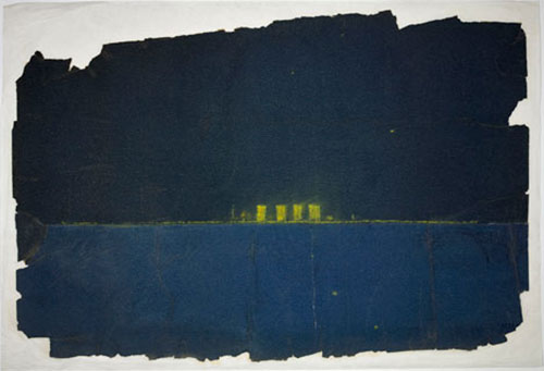

Le Corbusier’s sketch for the Administration City, 1929 Map of the “manzana loca” of the di Tella institute (thank you to Natalia Muñoa for sharing this image) in Retiro.
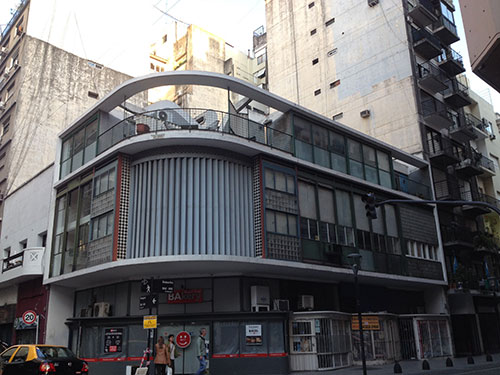
Suipacha and Paraguay Artists Ateliers designed by Antonio Bonet (with Horacio Vera Barros, and Abel López Chas), 1938.
Day 4: September 5, Buenos Aires
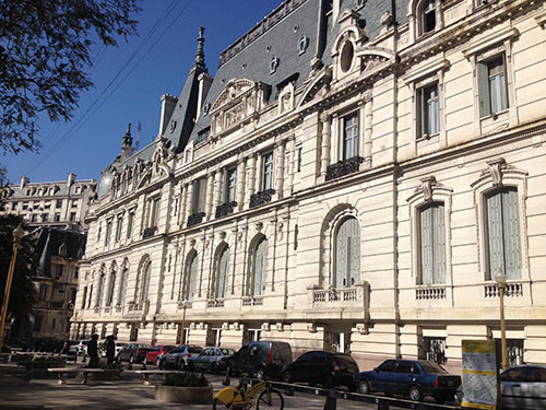
In the morning we walked from our hotel to the former mansion of porteño (inhabitants of Buenos Aires) elites, the Paz family. José C. Paz was the founder and owner of the newspaper La Prensa, as well as the Argentine ambassador to France from 1885–1893, which accounts for the building’s overwhelming Francophile design orientation (for example, there is a scaled-down version of the Hall of Mirrors in Versailles and the majority of the building materials were imported from France). Designed by Louie-Marie Henri Sortai, an established Beaux Arts architect, the facade resembles the Chateau de Chantilly, while the interior is historically and stylistically eclectic, each room representing a distinct European historical style associated with European royalty or nobility. After the Argentine nobility was dissolved in 1913, the government purchased the Paz mansion in 1938 and converted in into the military club (Círculo Militar), an elite social club for the armed forces. The Palacio Paz is one of many French-style palaces in Buenos Aires, reflecting the privileging of French culture among turn-of-the century porteño elites, who used historical pastiche as a way of aliging themselves with European continental culture.

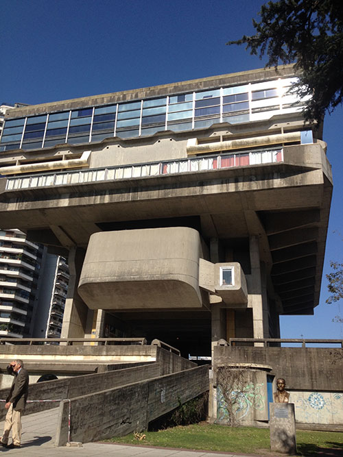
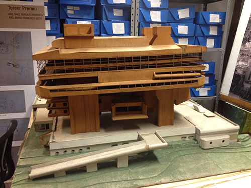
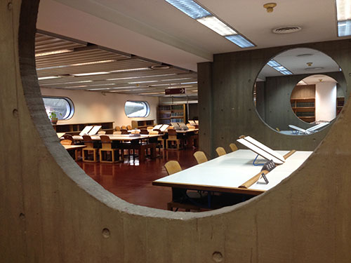
Our next destination was the Biblioteca Nacional (1961–1993) designed by Clorindo Testa, Francisco Bullrich and Alicia Cazzaniga. The commission for the library was conceived in 1958, three years after the coup d’etat that ousted Juan Perón, in a national decree that provided funding for a new national library. Located on the site of Juan and Eva Perón’s residence in the Recoleta neighborhood, the new library would replace the prexisting structure on México Street and would be the third building to house the national library. The decree called for a national competition that was overseen by then-director Jorge Luis Borges. Testa, Bullrich, and Cazzaniga’s winning proposal was selected on the basis of its open planta baja (ground floor) and its creative use of the site’s hilltop location and proximity to the river, which featured a massive concrete structure atop four pillars that would faciliate impressive views of the Rio de la Plata and surrounding landscape (reading rooms are located above and books are housed below). We were accompanied by architect Ana María Miyno, who runs the archive of the library’s architectural history. She drew our attention to architectural devices, such as voids and promenades that frame views of the architecture and the landscape, from sweeping vistas of the river to a close up of outside vegetation on the ground floor. The construction, which was interrupted by dictatorship and economic crisis, took over thirty years to complete.

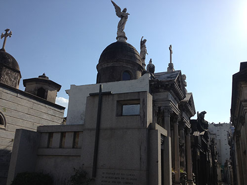
Recolata Cemetery

Mausoleum of José Paz, owner of La Prensa
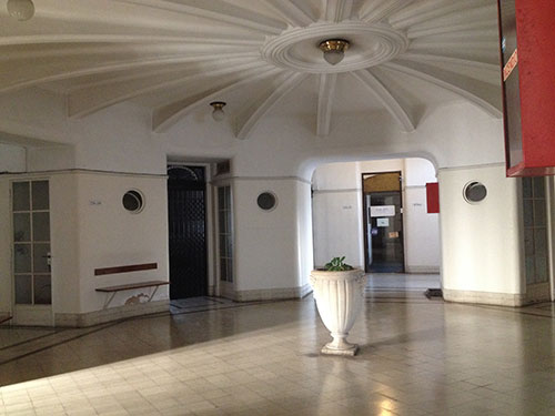
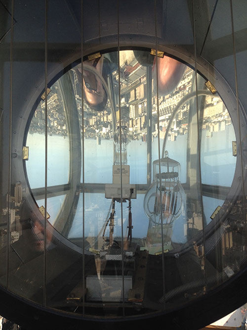
After taking a brief stroll through the Recoleta cementery, we visited the second (but earlier) Palanti skyscraper. The Palacio Barolo (formerly known as the Galeria Presidente Quintana) occupies a promiment location along the Avenida de Mayo, the Haussmannian avenue of Buenos Aires. Like its brother building in Montevideo, the Palacio Barolo was commissioned by an Italian immigrant Luis Barolo, who earned his fortune in the textile industry. The structure is a synthesis of modern and traditional in its structural and ornamental use of reinforced concrete. Although the structure takes advantage of advancements in modern technology, the overall decorative scheme is characteristic of Art Deco and late 19th century eclecticism, combining diverse stylistic motifs ranging such as Gothic and historical references (Palanti was interested in Indian monuments such as the Palace of the Winds in Jaipur). The popular myth surrounding the Palacio Barolo as a modern temple to Dante is very much part of the official tour experience of the building. Vistiors are led through its three programmatic parts—shopping arcade on the ground floor, offices in the lower volume, and tower— on a corresponding journey through hell, earth, and, heaven. Although Palanti’s persisent search for a national style makes the Dante reference seem somewhat plausible, Natalia explained that some scholars have tried to complicate this narrative, arguing that there is no archival documentation of the tripartite Divine Comedy scheme nor any evidence that Dante’s remains were planned to be reinterred at the Palacio Barolo. A highlight of the tour was our ascent to the very top of the tower (via a series of very narrow sprial staircases, not for the claustrophic or those afraid of heights), where there was a lighthouse that originally communicated with the Palacio Salvo across the river.

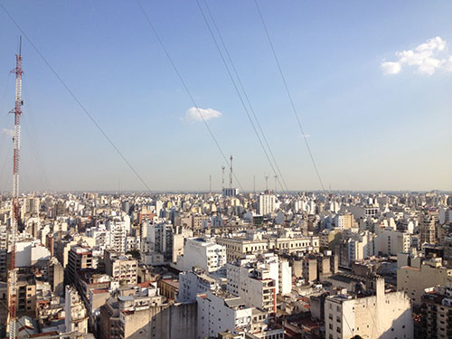

Day 5: September 6, Buenos Aires
Today was a more historic neighborhood-oriented day, experienced mostly on foot. We checked off several of the most iconic monuments in the city, such as the Plaza de Mayo, the Casa Rosada (the seat of the national government), and the national cathedral. We started off walking around Puerto Madero, an area that was originally developed in the mid-19th century as the city expanded and required new infrastructural development. After widspread debate, the national government decided to develop a new, modern main port (the existing port in La Boca was too shallow for ships to dock). The developer Eduardo Madero forwarded a proposal that relocated the main port closer to the city center, reaffirming its symbolic importance. The construction was overseen by an English firm (likely referred by the London-based firm that financed the project). The new port was inaugurated in 1889 but was plauged with technial problems from the outset, which led to the establishment of the Puerto Nuevo in 1911. Puerto Madero, no longer used as functioning port, fell into a state of decay, and although several plans attempted to revitalize this area of the city, it was not until the 1980s when the Secretary of Urban Planning called for a comphrensive strategy for a waterfront restoration project. The area is now known for it sleek high-rises, refurbished warehouses, and bridge designed by Santiago Calatrava, but vestiges of its history remain, such as the grain silos that Le Corbusier reproduced (based on the images that Gropuis published) in Vers une architecture and the English-style, brick warehouses that reflect the history of English investment in Buenos Aires.


After Buenos Aires was declared Argentina’s capital in 1880 (following many years of internal power struggles among the provinces), the ruling elites of the city began searching for an appropriate architectural expression of the nation. The Italian architect Francesco Tamburini was tasked with unifying two existing structures in the historic city center facing the Plaza de Mayo, the Palacio de Correos and Telegrafos (the central post office, designed by Carlos Kihlberg in 1873) and the Casa de Gobierno (designed by Henrik Äberg in 1882). Tamburini connected the two structures and closed the street between them with a central arch, forming the facade that now faces the Plaza de Mayo.

A view of the Casa Rosada from the Banco de la Nación (taken the following day).
Next we stopped very briefly in a barrio near the city’s old port, La Boca (the mouth), which is where boatloads of, primarily Italian, immigrants arrived in the early 20th century. It is historically a working-class neighborhood and a popular tourist destination known for its colorful tin houses and the pedestrian street Caminito.

We had the afternoon free to explore the historic neighborhood of San Telmo, where layers of Buenos Aires’s colonial past, such as its cobblestone streets and iron lanterns, are still preserved among more modernist houses. Architecturally-speaking, it is a very unique and eclectic neighborhood of the city. Several of us perused the market, enjoyed lunch at an authentic pizza place, and visited the MAMBA (Museo de Arte Modern de Buenos Aires). I was particularly excited that our visit coincided with an exhibition of 1960s Argentine avant-gardes entitled La paradoja del centro (The Paradox of the Center).
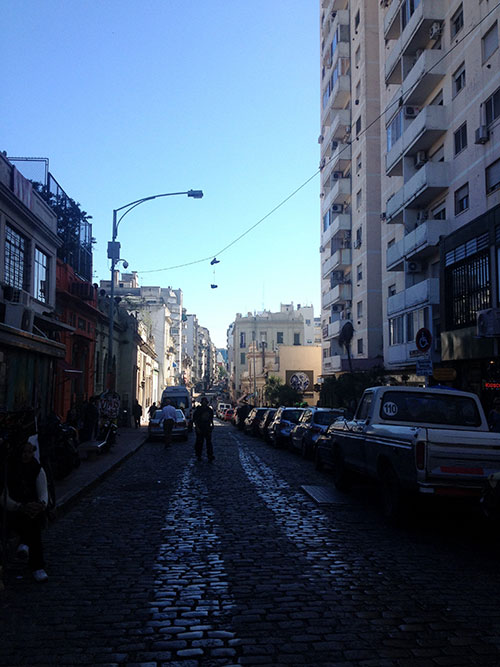
Streets of San Telmo
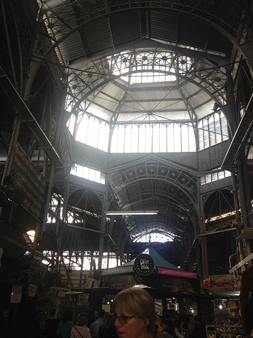
Inside the Mercado de San Telmo
Day 6: September 7, Buenos Aires: Financial district (“La City”) and a Tale of Two Theaters
We began the day in the financial district day know as La city. Due to the concentration of foreign capital in Agentina beginning in the mid-19th century, there is a profusion of national architectural styles in this area of the city. We were accompanied by a colleague of Natalia’s named Juan who works for the city and shared his knowledge about La City’s rich architectural history.
Our first stop was Galeria Güemes designed by Italian architect Francisco Gianotti (who worked alongside his fellow countryman Mario Palanti on the Italian Pavilion for the 1910 Centennial Exposition) and is considered Buenos Aires’s first skyscraper. It was designed as a mixed-use skyscraper, combining offices, apartments, a cinema, theather, restaurants, a cabaret, a bank, and other businesses all within a single 116 x 29 meter plot. The Güemes was also home and stomping ground to various illustratious literary types: Antoine de Saint-Exupéry lived in the building and Julio Cortázar was known to spend his time there. His allusions to the Güemes in the short story “El Otro Cielo” (“The Other Sky”) capture the bohemian atmosphere that existed alongside the more mainstream commercial activities of the structure.
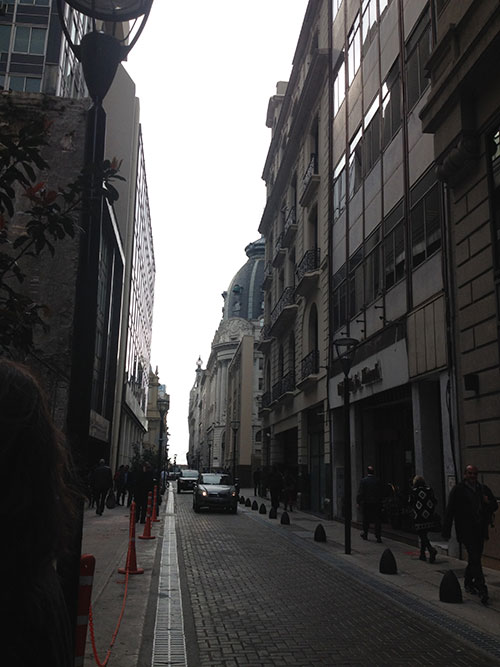

Narrow streets of the financial district Commercial arcade on first floor of the Güemes, Buenos Aires’ “Art Nouveu icon.”

Subterranean cabaret theater at the Güemes, in an area where the “forbidden realistic films” alluded to by Cortázar would have been screened.
From the Güemes we visited the Banco de la Nación Argentina (National Bank of Argentina) on the site of the former Teatro Colón. The site was strategically selected for its practical location on the edge of the financial district and its symbolic proximity to the Casa Rosada and the Plaza de Mayo. Designed by Alejandro Bustillo, the bank begaun undergoing construction in the midst of World War II, therefore it was built using local materials. Bustillo looked to other federal models in both Washington D.C. and Berlin; its monumental neoclassical facade evidences the influence of the former while the sublime rationalist interior suggests the influence of architecture of the Third Reich. Unforunately I have limited decent photgraphy from this visit since photography/cell phone use is prohibited in banks in Argentina.

Alberto Prebisch’s Obelisco (1936), as seen from the bus ride along the Avenida de 9 de Julio.
Next on the itinerary was the Teatro Cólon, which formerly occupied the site of the Banco de la Nación until 1882 when the city refused to renew its lease. The new theater was designed by Italian architect Francesco Tamburini (the architect who unified the pre-exisitng structures of the Casa Rosada), who looked to international models to inform the design, and was modified by his assistant, Vittorio Meano. After the latter’s death, the theater was completed by Jules Dormal who introduced different classical orders and ornamental systems more characteristic of French influences. The resulting architecture is eclectic, consisting of Italian neo-Renaissance and Baroque stylistic motifs.
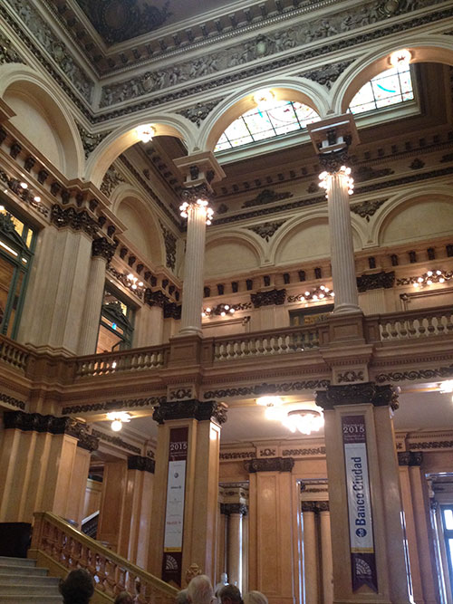

One of the salons/social spaces where wealthy ticket-holders congregated to see (others) and be seen.

Inside the theater: The acoustcs are the same from the most expensive private box to the gallinero (hen house).
After visiting the Teatro Colón we enjoyed a quick lunch of empanadas and authentic parilla, during which Natalia announced a “surprise” visit to another theater. We walked a short distance to the modernist Teatro San Martín designed by Mario Roberto Álvarez during the Peron era (begun in 1953), and currently under construction. Natalia introduced us to architect Silvio Plotquin, who recently contributed the entry on Argentina to the MoMA catalogue. Silvio generously offered a tour of the building and introduced us to the architects working on its renovation. He explained that the modernist theater was Peron’s strategic attempt to appeal to Argentina’s middle class. The theater was also the site of exhibitions of concrete art and was an important example of integración plástica in Argentina (as exemplified by Luis Seoane’s mural pictured below). The theater’s rather anonymous façade, a curtain wall of glass and steel, is deceiving: the building consists of three programmatic parts within a single city black. The tallest mass contains two performance theaters and a lower level space for exhibitions. Unfortunately since the theater is undergoing massive construction at this point in time, the team of architects lamented that we would not see it in its new and improved finished state. However, we were all very pleased with this exciting last-minute addition to itinerary.
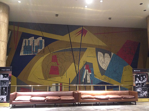
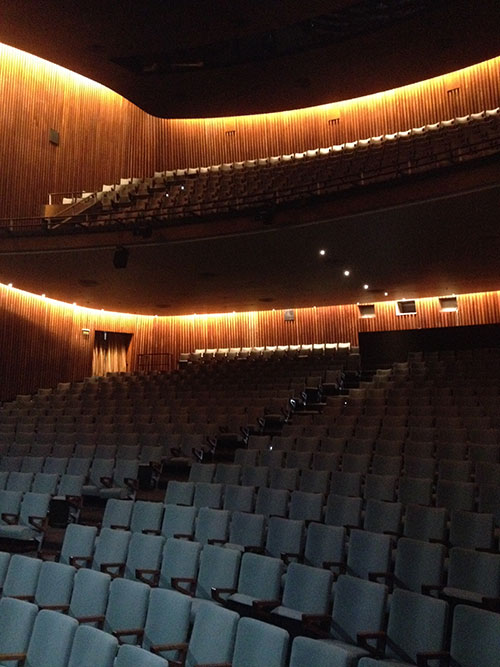
Although the behind-the-scenes tour with the architects in charge of the Teatro San Martín’s renovations felt like an experience difficult to top, the “grand finale” that awaited us was the highly anticipated visit to the Banco Londrés y América del Sur (The Bank of London and South America, now the Banco Hipotecario) designed by Clorindo Testa and SEPRA (Sanchez Elia, Federico Peralta Ramos, and Alfredo Agostini). We returned to the financial district for a formal tour of the bank, a symbol of British investment in the Rio de la Plata and architectural monumentality in 20th century Argentina. At the time of its construction in the early 1960s, the Bank of London was one of the preeminent banks of the world. The structure’s daring technological innovation and spatial inventiveness were intended to reflect the bank’s global prominence. The massive concrete structure, however, still responds to and respects the traditional surrounding urban fabric. Although this building is frequently touted as an important example of Brutalism in Latin America, Jorge Francisco Liernur has tried to complicate and nuance the application of this frequently over-used term to this particular building.

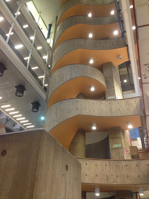
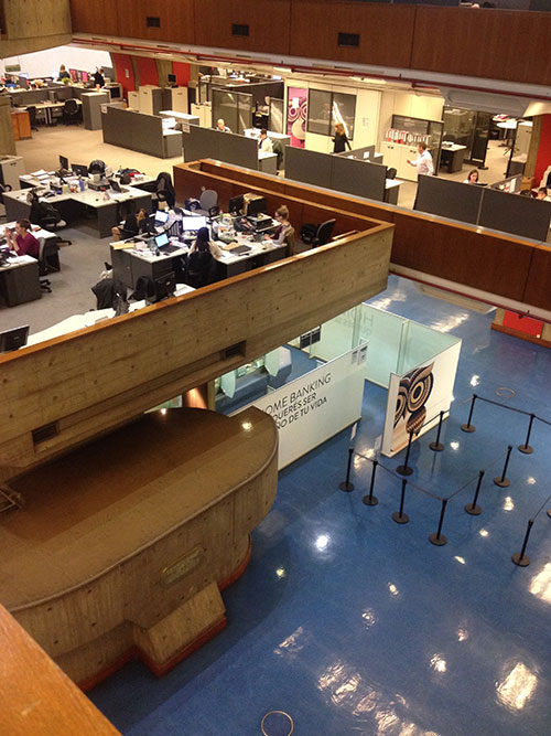

The interior color scheme was adapted after the bank changed ownership, but the original colors were similarly vibrant, typical of Testa’s design aesthetic.
Day 7: September 8, La Plata
La Plata was founded in 1882 as the capital city of Buenos Aires province, two years after Buenos Aires was declared the nation’s capital. The city’s plan is a perfectly symmetrical 36x36 square grid, marking a departure from Law of the Indies urban planning, and reflecting more recent late 19th century planning models in North American cities such as Chicago and Philadelphia, and the urban expansion plan in Barcelona.
On our excursion to La Plata we were incredibly fortunate to travel with scholar Jorge Francisco (“Pancho”) Liernur, one of the co-curators of the Latin America in Construction exhibition at MoMA and expert in the architectural history of Argentina and Latin America. On our bus ride out to La Plata, Pancho explained the history of the Casa Curutchet, which in addition to the Carpenter Center at Harvard, is the only other project designed by Le Corbusier that was ever realized in the Americas. In his book on La Red Austral, a network of Le Corbusier’s Argentine disciples, Liernur was interested in the question of why Le Corbusier, in the late 1940s, accepted the commission in the first place. The Casa Curutchet was, in many ways is “a transitional house” in the scope of Le Corbusier’s villas. It was commissioned in 1948 by the surgeon Dr. Pedro Curutchet, who was somewhat of an outlier in the medical establishment in Argentina. The combined home and office in La Plata was intended to reflect his forward-thinking approach to the profession and to attract new patients. The project presented a major a design challenge from the start: located within a narrow lot, Le Corbusier also had to respect the two pre-existing houses on both sides. In his chapter on the Casa Curutchet, Liernur suggests that the house needs to be considered in the broader context of Le Corbusier’s proposals for Buenos Aires. He argues that the house demonstrated that he was capable of respecting tradition (after criticisms of his tabula rasa schemes for Buenos Aires) while forwarding an innovative, modern design solution. The street-side of the house, the area covered by the reinforced concrete brise-soleil, is the public area (waiting room, office and surgical space), while the bedrooms and living rooms occupy the taller double-height area at the rear of the house, allowing for greater privacy. Le Corbusier did not travel to Argentina again after accepting the commission and asked Amancio Williams to supervise the construction in La Plata, who also introduced interpretations and modifications to the plan. According to Liernur, Williams’ exactness is what results in some of the more awkward design flaws, but his modifications also corrected and improved some aspects of the design (such as the staircase).
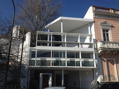
View of the Casa Curutchet from the park across the street.
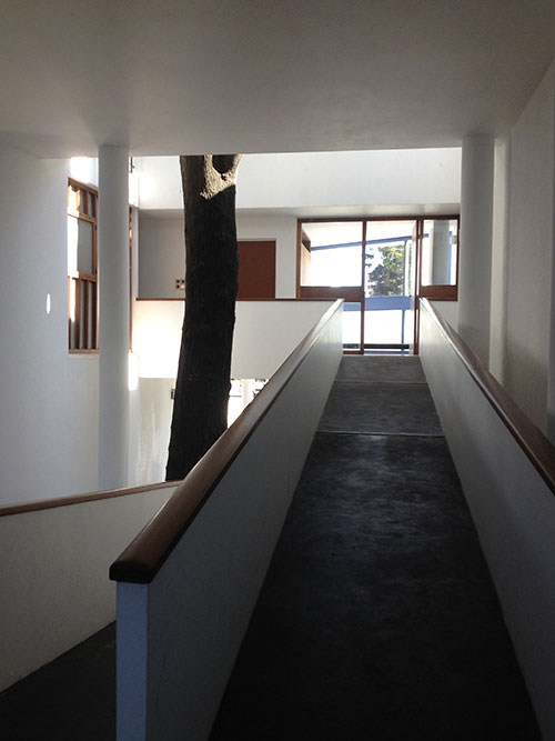
The house conforms to Le Corbusier’s “5 points,” but rather than design a roof top garden, the Casa Curutchet incorporated a tree into the design, as a means of folding landscape into the plan and unifying the composition.
After brief visits to La Plata Cathedral (a rare example of Argentine Neo-Gothic style, which also took over 100 years to complete!) and the town hall, we visited La Plata’s Natural History Museum, a quintessential 19th century museum (after the Curutchet house, this visit also represented a continuation of the day’s theme of convergences between scientific/medical and architectural discourses). Founded by scientist, naturalist, explorer and geographer Francisco “Perito” Moreno, the museum was designed to house his collection of anthropological, archeological, and paleontological artifacts and library. The German engineer and Swedish architect designed a neoclassical style building in an elliptical shape. Moreno provided substantial input into the design, which attempted to translate evolutionary theory into architectural form: the elliptical plan and its internal organization, from minerals and stones, to plants and animals, to human beings corresponded to what Moreno called the “biological ring. Also notable in the museum’s design is the incorporation of pre-Columbian decorative motifs that adorn the façade, entryway, and various galleries on the interior, an early example of indigenismo in Argentine art and architecture.
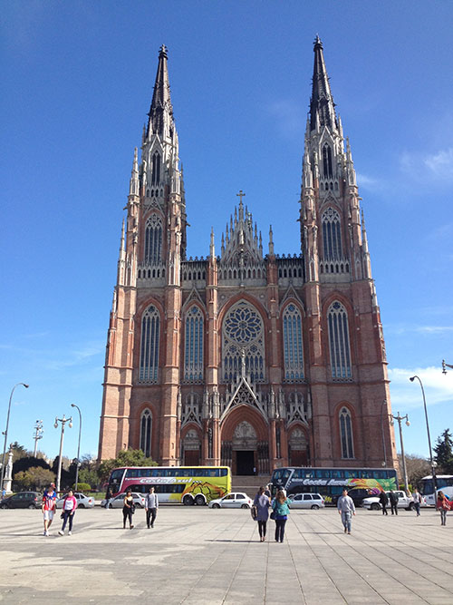
La Plata Cathedral (1885-1999)

A bust of Prussian naturalist, Alexander von Humboldt, sculpted by Venetian artist Victor de Polis on the exterior of the museum. The sculptures of scientific figures alternate with paintings of pre-Columbian objects, such as Moche ceramics seen here.

View of the interior of the museum.
Day 8: September 9, Córdoba
After our day in La Plata, we returned to Buenos Aires for a final evening of leisure. Although it was difficult to leave Buenos Aires after such a brief visit, we looked forward to our visit to Córdoba, a city where the Jesuit Order had a strong influence in its historical and cultural development, beginning in the beginning of the 17th century. For this reason, the final days of the itinerary were more colonial-focused, in terms of architecture and history. After the short flight, we visited the “Manzana Jesuítica” (Jesuit Block), which along with the five estancias (farming estates), have collectively been designated a UNESCO World Heritage Site. The Jesuit block consists of a church (in a colonial Baroque style), the Colegio Máximo (which is still a functioning school, “Our Lady of Montserrat”), and the university. The entire block is organized like a European convent, organized in a cloister layout. Córdoba is also very important in the history of educational reforms in Argentina; it was the epicenter of the 1918 reform to modernize education, the influence of which reverberated throughout schools in Latin America.
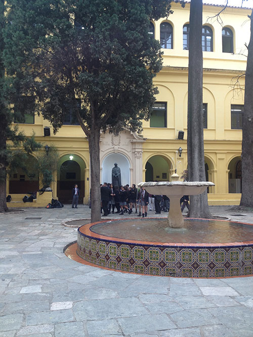

Day 9: September 10, Córdoba
We started the day visiting two fine arts museums that feature recent architectural interventions (reflecting the provincial government’s 2005 marketing campaign to make Córdoba the “cultural capital” of the province): the Museo Provincial de Bellas Artes Emilio Caraffa and the Museo Superior de Bellas Artes Evita (formerly the Palacio Ferreyra). The former, incorporates the neoclassical façade of the original provincial museum, designed by Hungarian architect Johannes Kronfuss in 1915, and connected it to another pre-existing structure, the Physical Education Institute. The former Palacio Ferreyra was the luxurious Beaux-Arts mansion of the surgeon Martín Ferreyra, which was expropriated by the government and now houses a museum of provincial art. The architectural firm hired to refurbish the building opted to preserve the entrance and grand staircase but its intervention understandably provoked debate and controversy: it consists of a cowhide-covered staircase, which was originally incorporated following plans to open a boutique hotel inside the museum.

View of the Museo Caraffa from across the street

Interior of the former Palacio Ferreyra/Museo Superior de Bellas Artes Evita

The recent intervention at the Museo Superior de Bellas Artes Evita
After lunch we stopped briefly at another (earlier) building designed by SEPRA, Córdoba’s town hall, which was a result of a 1953 national competition. Unforutnately many of the spaces in the interior have been subdivded and do not reflect the original open interior plan. Overall the project is notable for its monumentality, brise-soleil and regulating lines that adorn the facade. The principals of SEPRA were inspired by Auguste Perret’s 1937 visit to Buenos Aires, which is evident in the fusion of modernist techniques and academic planning.

SEPRA, Municipalidad de Córdoba (Cordoba’s Town Hall), 1953–1961)
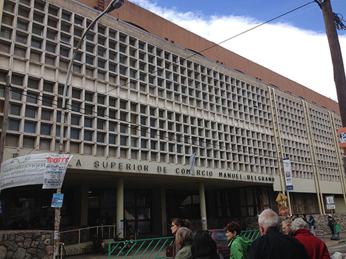
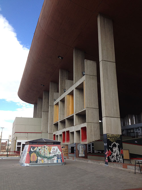
One of the highlights of the entire trip for me was our final site visit of the day to the Escuela Superior de Comercio “Manuel Belgrano.” From the street, the modernist facade and brise-soleil completely defy expectations; upon entering the school, the vast space opens up toward a courtyard on the upper floor opposite a monumental canopy. We happened to visit on a day when class was not in session and there were no students or faculty present (the previous day students had also been marching to defend public education), which heightened the sense of interior expansiveness. Although the use of elements such as béton brut, brise soleil, concrete promenades and sculptural volumes evidence the impact and awareness of of postwar Corbusian motifs (specifically at Chandigarh), the architects add a layer of complexity by extending the open plan to the upper level and creating a dialogue with the surrounding urban context. It was impressive to see and experience such a monumental space designed for a high school in a style that had become more common for government buildings and banks. Like many public schools in Latin America, the walls were plastered with colorful murals and political fliers and pamphlets. A memorial in the lower level garden area is dedicated to students of the school who were disappeared by the dictatorship in the era known as the Dirty War (1976–83).

Day 10: September 11, Córdoba
On our final day, we visited two Jesuit estancias, Santa Catalina and Alta Gracia on the outskirts of Córdoba. The estancias were self-sufficient entities that provided food and other important staples for the Order, as well as while financed its missionary and educational activities. Santa Catalina (f. 1622) is the largest of the estancias, and includes a church, which is one of the most well preserved examples of the “colonial baroque” style (which features an immense pulpit and retablo from Alto Perú and paintings in style of the Cusco School), residences for the priest and for the African slaves and indigenous laborers who made up the workforce, the apprentices’ house (now destroyed), a mill, and a reservoir. The Jesuits were expelled from the Spanish Crown in 1767; the estate was then purchased by then-mayor of Córdoba and has remained a family property since 1774.
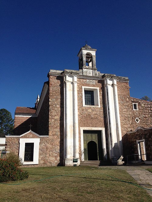

Alta Gracia estancia
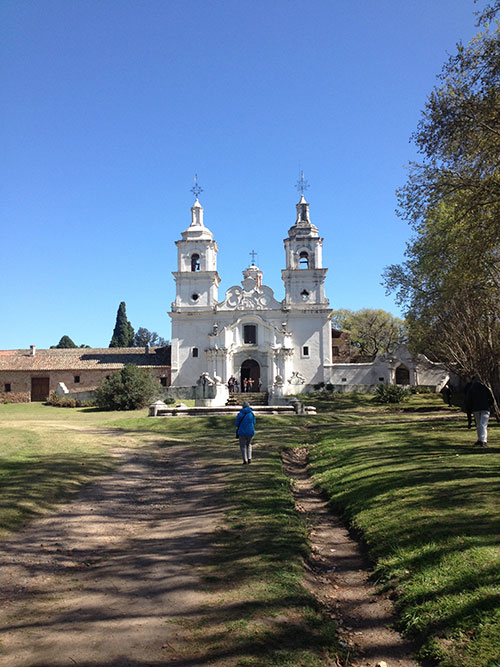

Approaching Santa Catalina
After our visit to Santa Catalina, we enjoyed a final meal together before parting ways at the Córdoba airport. Several members of the group continued on to Salta in the north of Argentina, but I had to return to New York to begin teaching a course on Latin American modern architecture in Latin America (the experience certainly strengthened my lectures on Argentina and Uruguay!). I am incredibly honored to have been the Scott Opler Fellow on this study tour to the Rio de la Plata and am grateful to SAH, my fellow tour participants, our guides, Sinead Walshe, SAH representative Sandy Isenstadt, and particularly to Natalia Muñoa, for sharing her extensive knowledge with us.
 Liz Donato is a PhD candidate in art history at the Graduate Center, CUNY. Her research focuses on mid-20th century architectural modernisms and pedagogy in Latin America, with an emphasis on the Southern Cone of South America. Her dissertation, “The Intimate City: The School of Valparaíso in the Urban Sphere, 1952–1972” examines collaborations among artists, poets, and architects and the politics surrounding the School’s staging of a vanguard culture in postwar Chile. She has taught courses in Latin American modern and contemporary art and architecture at City College of New York, where she was formerly a Graduate Teaching Fellow, and Parsons School of Design, the New School.
Leave a commentOrder by
Newest on top Oldest on top