-
Membership
Membership
Anyone with an interest in the history of the built environment is welcome to join the Society of Architectural Historians -
Conferences
Conferences
SAH Annual International Conferences bring members together for scholarly exchange and networking -
Publications
Publications
Through print and digital publications, SAH documents the history of the built environment and disseminates scholarshipLatest Issue:

-
Programs
Programs
SAH promotes meaningful engagement with the history of the built environment through its programsMember Programs
-
Jobs & Opportunities
Jobs & Opportunities
SAH provides resources, fellowships, and grants to help further your career and professional life -
Support
Support
We invite you to support the educational mission of SAH by making a gift, becoming a member, or volunteering -
About
About
SAH promotes the study, interpretation, and conservation of the built environment worldwide for the benefit of all
Kahn Tour: Narrow Views
by: J. Tobias

No object is entirely apart from its surroundings and therefore cannot be represented convincingly as a thing in itself…
What about when the object surrounds you so tightly you can’t represent it convincingly as anything?
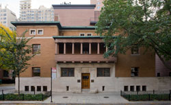
Kahn’s Richards Medical Building at Penn (1957-1965) is a hard building to love. It’s also a hard interior to draw. Why? The interior is so tight that it lacks vantage points. And forty years on, it’s even more crowded, with mystery machines lining the halls.
This helps to explain why most published images are exteriors (see the 1991 Kahn exhibition catalog and the documentary My Architect, for example.) One exception is the view looking out from a floor-to-ceiling hall window and into a cantilevered lab space. It was the only interior published in an entire issue of the MoMA Bulletin devoted to the building (most other images concern structure). The same image is reprinted in the 1991 book, also the only interior view.
Quotes from Louis Kahn. “The Value and Aim in Sketching.” T-Square Club Journal of Philadelphia. May 1931, 18-21

No object is entirely apart from its surroundings and therefore cannot be represented convincingly as a thing in itself…
What about when the object surrounds you so tightly you can’t represent it convincingly as anything?
Kahn’s Richards Medical Building at Penn (1957-1965) is a hard building to love. It’s also a hard interior to draw. Why? The interior is so tight that it lacks vantage points. And forty years on, it’s even more crowded, with mystery machines lining the halls.
This helps to explain why most published images are exteriors (see the 1991 Kahn exhibition catalog and the documentary My Architect, for example.) One exception is the view looking out from a floor-to-ceiling hall window and into a cantilevered lab space. It was the only interior published in an entire issue of the MoMA Bulletin devoted to the building (most other images concern structure). The same image is reprinted in the 1991 book, also the only interior view.
This made the behind-the-facade tour a rare and intriguing opportunity, And the interior is fascinating, especially the labs. Such as a “vintage” model, decommissioned to redirect the building’s limited air supply to working labs, such as a lively one we visited. It would be fun to return and sketch the ghostly abandoned lab, its notoriously inefficient windows looking out on to a rusticated pile nearby. A modern ruin.
A hard building to love–but its caretakers seem to. The way one might love an Edsel. Maureen Ward, Director of Facilities Planning and Space Management at the Medical School, even jokes with her counterpart at the Salk Institute (1959-1965), Richards’ well-behaved younger brother: there Kahn had a chance to work out all the kinks.
Quotes from Louis Kahn. “The Value and Aim in Sketching.” T-Square Club Journal of Philadelphia. May 1931, 18-21


Leave a commentOrder by
Newest on top Oldest on top