-
Membership
Membership
Anyone with an interest in the history of the built environment is welcome to join the Society of Architectural Historians -
Conferences
Conferences
SAH Annual International Conferences bring members together for scholarly exchange and networking -
Publications
Publications
Through print and digital publications, SAH documents the history of the built environment and disseminates scholarshipLatest Issue:
-
Programs
Programs
SAH promotes meaningful engagement with the history of the built environment through its programsMember Programs
-
Jobs & Opportunities
Jobs & Opportunities
SAH provides resources, fellowships, and grants to help further your career and professional life -
Support
Support
We invite you to support the educational mission of SAH by making a gift, becoming a member, or volunteering -
About
About
SAH promotes the study, interpretation, and conservation of the built environment worldwide for the benefit of all
Kahn Tour: Deep Structure
by: J. Tobias
While Kahn understood that “Drawing is a mode of representation,” he saw photography as a means of “imitating exactly:” “Photographs will serve you best of all, if that is your aim.”
Today we tend to think more critically about photography as an imitator of reality. We’re more likely to see it as just another mode of representation, a “truth effect.” We intuitively understand drawings as representations, but most of us learn about architecture through photographs, and it’s easy to forget that they, too, are interpretive. As a librarian, scholar, and sketcher, visiting the sites of iconic photographs allows me to compare representations with subjective reality. Visiting Robert Venturi’s “Mother’s House” (1959-1965) was a chance to experience a much-photographed work that directly engages the notion of architecture as image and sign.
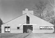
Bill mentioned that Venturi’s design drawings tend toward fully-formed elevations, rendered quickly and in rapid succession (so unlike Kahn’s searching, mutable charcoals). True to form, the Vanna Venturi House facade is at first glance a flat image, an iconic gabled house. And its published imagery responds in kind, invariably represented by a frontal photograph. (Notably, several in the tour group had themselves photographed straight-on in front of the house).
Published photographs of the Venturi facade are often juxtaposed with an oblique view of the rear, which of course complicates and contradicts the facade. Ironically, the complexity of the back makes it hard to illustrate frontally. Unfortunately I didn’t get a chance to draw it. The challenge would have been to communicate its volumes within the limits of a frontal view, making a joke of his joke. I like to think the architect would appreciate it.
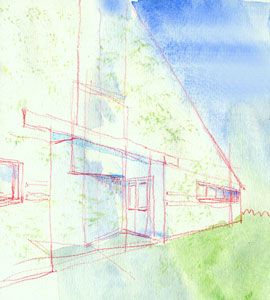
I approached the facade from a literally different angle–the sharpest I could find. The diagonal lines of the result remind me of Ed Ruscha’s gas station prints, as in Standard Station (1966). Ruscha is contemporary of Venturi and similarly interested in popular imagery. In this series Ruscha exaggerates the machine aesthetic and corporate symbolism of the American gas station (think Walter Dorwin Teague), stretching it into the hard-edged Pop of strip culture. The artist and architect remind us that three dimensional buildings are always/already also two-dimensional signifiers.
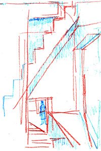
A particularly complex space I’d like to have taken more time to untangle is the front window/overhang/ledge. Is there even an architectural term to describe it? It sneaks up on you, hidden behind the broken pediment and cross beam. Yet it heralds the spiral vortex around which the house spins, bringing you up the stairs in a dance with the chimney. Here’s my take from second floor, heading up to the stair to nowhere.
While Kahn understood that “Drawing is a mode of representation,” he saw photography as a means of “imitating exactly:” “Photographs will serve you best of all, if that is your aim.”
Today we tend to think more critically about photography as an imitator of reality. We’re more likely to see it as just another mode of representation, a “truth effect.” We intuitively understand drawings as representations, but most of us learn about architecture through photographs, and it’s easy to forget that they, too, are interpretive. As a librarian, scholar, and sketcher, visiting the sites of iconic photographs allows me to compare representations with subjective reality. Visiting Robert Venturi’s “Mother’s House” (1959-1965) was a chance to experience a much-photographed work that directly engages the notion of architecture as image and sign.

Bill mentioned that Venturi’s design drawings tend toward fully-formed elevations, rendered quickly and in rapid succession (so unlike Kahn’s searching, mutable charcoals). True to form, the Vanna Venturi House facade is at first glance a flat image, an iconic gabled house. And its published imagery responds in kind, invariably represented by a frontal photograph. (Notably, several in the tour group had themselves photographed straight-on in front of the house).
Published photographs of the Venturi facade are often juxtaposed with an oblique view of the rear, which of course complicates and contradicts the facade. Ironically, the complexity of the back makes it hard to illustrate frontally. Unfortunately I didn’t get a chance to draw it. The challenge would have been to communicate its volumes within the limits of a frontal view, making a joke of his joke. I like to think the architect would appreciate it.

I approached the facade from a literally different angle–the sharpest I could find. The diagonal lines of the result remind me of Ed Ruscha’s gas station prints, as in Standard Station (1966). Ruscha is contemporary of Venturi and similarly interested in popular imagery. In this series Ruscha exaggerates the machine aesthetic and corporate symbolism of the American gas station (think Walter Dorwin Teague), stretching it into the hard-edged Pop of strip culture. The artist and architect remind us that three dimensional buildings are always/already also two-dimensional signifiers.

A particularly complex space I’d like to have taken more time to untangle is the front window/overhang/ledge. Is there even an architectural term to describe it? It sneaks up on you, hidden behind the broken pediment and cross beam. Yet it heralds the spiral vortex around which the house spins, bringing you up the stairs in a dance with the chimney. Here’s my take from second floor, heading up to the stair to nowhere.
Unlike most of the works we visited, in person I found the experience had a sort of photographic quality, as if I could only see it through the filter of published imagery. Perhaps this is because one tends to stand at photogenic vantage points, as if the building was designed for (or through) them. Living there might feel different, but as a guest I couldn’t kick back in front of the fireplace.
In their works Venturi and Ruscha (as well as cultural studies theorists) ask, To what degree is subjectivity influenced by culture, specifically media culture? Am I me or mediated? The architect and artist most likely believe in mediated individuality. Kahn no doubt believed in pure subjectivity, especially as expressed through sketching, where “…the presence of our own individuality causes [things] to appear differently than it would to others.”
Image (top): Rollin LaFrance. Robert Venturi. Vanna Venturi House (1959-1964).

Leave a commentOrder by
Newest on top Oldest on top